

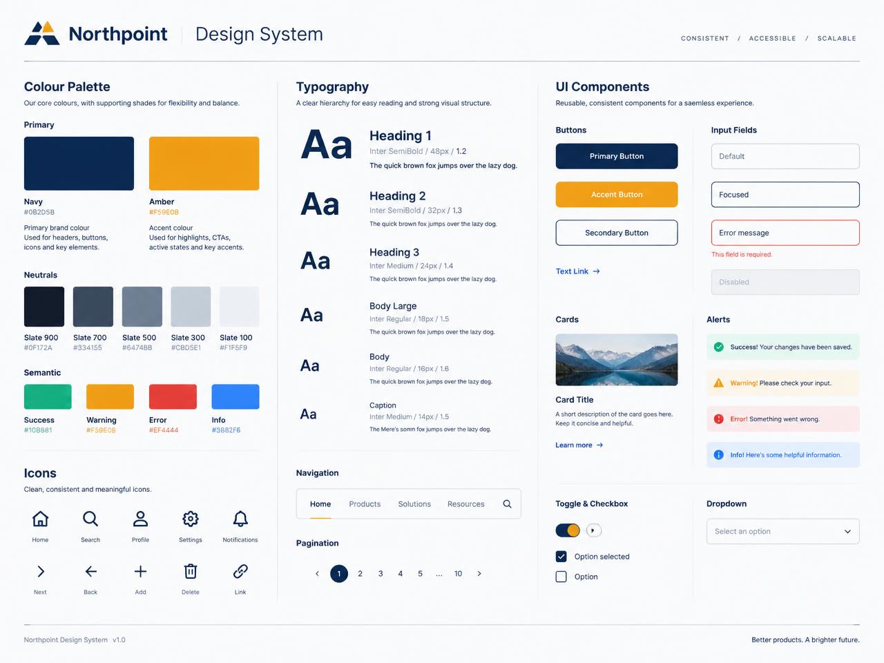
A software company was shipping four products that all looked and behaved differently. We audited every screen, defined a single design language — colour, type, spacing, states, accessibility rules — and delivered it as a documented component library their engineers build from. New screens now take days instead of weeks.
120+
documented components
AA
accessibility baseline
3x
faster screen delivery
What we did
- UI audit across four existing products
- Colour, typography and spacing system
- Accessible component specifications
- Coded component library and documentation
- Team handover and design reviews
Stack
One visual language
Tokens for colour, type, spacing and elevation that every product shares.
Accessible by default
Contrast, focus states and keyboard behaviour specified for each component.
Code and design in sync
The design library and the coded components ship from the same source of truth.
Written guidance
Usage rules and do/don't examples so new team members apply it correctly.
More of our work
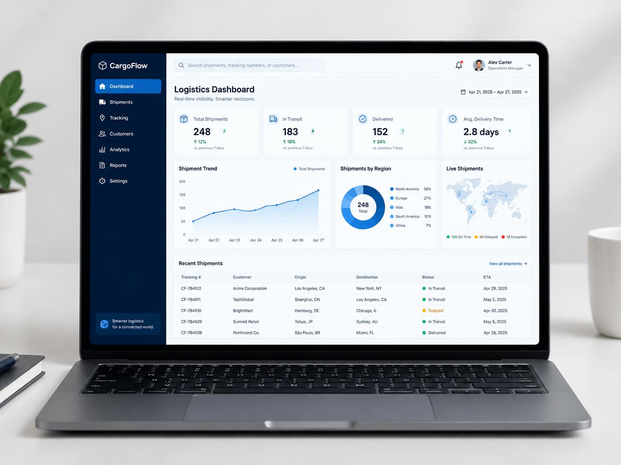
Logistics operations platform
A shipment operations dashboard that replaced spreadsheets for a mid-sized freight team.
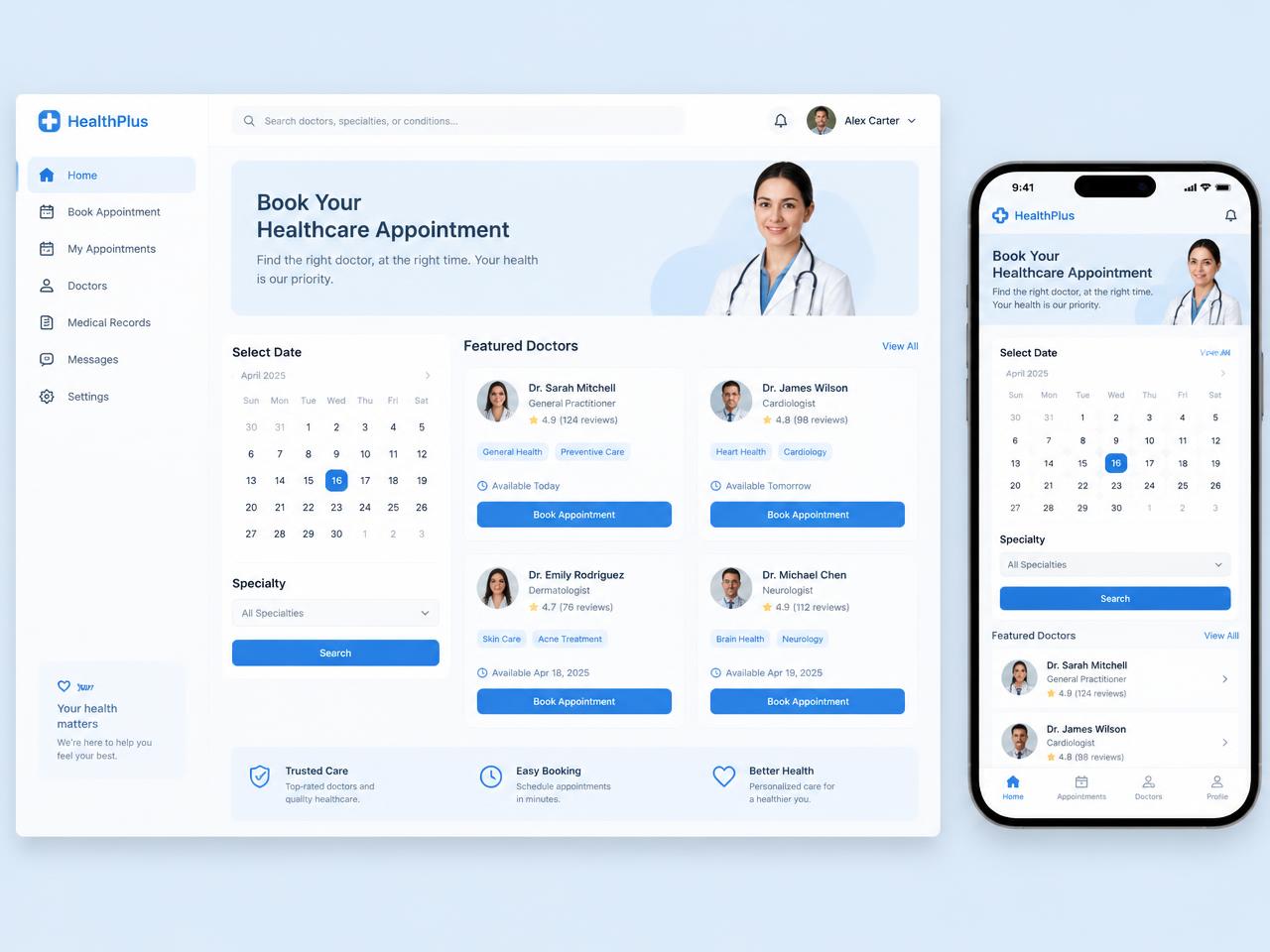
Healthcare booking app
A calm, accessible appointment booking experience for a multi-clinic practice group.
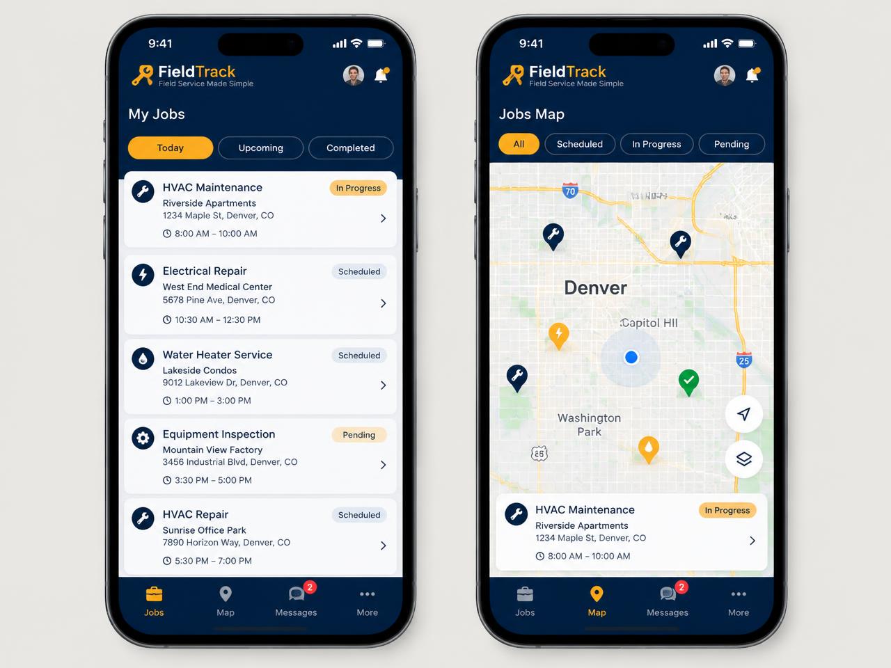
Field service mobile app
An offline-capable job app that keeps maintenance engineers off paper worksheets.
Want something like this?
Tell us what you're building and we'll map the fastest honest route to launch.
Book a consultation